|
After presenting my portfolio site in class, I was able to get some good feedback on how to improve my site. What I plan on working on for my portfolio site based off the feedback I received is to redo the projects section. The images of the projects are appearing too small based due to the Bootstrap tool I am using. I plan to re-do this section by displaying the projects in a table like format with the description of the project on the left side, along with a link to the source code and working sites, and the thumbnail image of the project on the right side.
What I felt that I had the most take away from this class was the mini-research assignments we had throughout the quarter. The assignments were really interesting with how it pushed us to look for elements within an artifacts to try and draw information from. I felt that these research assignments helped me learn how to research more critically and analyze subjects on a deeper level. Now that the quarter is over, I would like to continue working on improving my portfolio site for one, but also work on my overall design skills. The design sections we went over during the quarter was helpful and interesting and I would really like to learn more. Ideally, I would like to go back to these design sections we studies and examine them again so I can continue to research more design practices.
0 Comments
WireframeDesktop View:  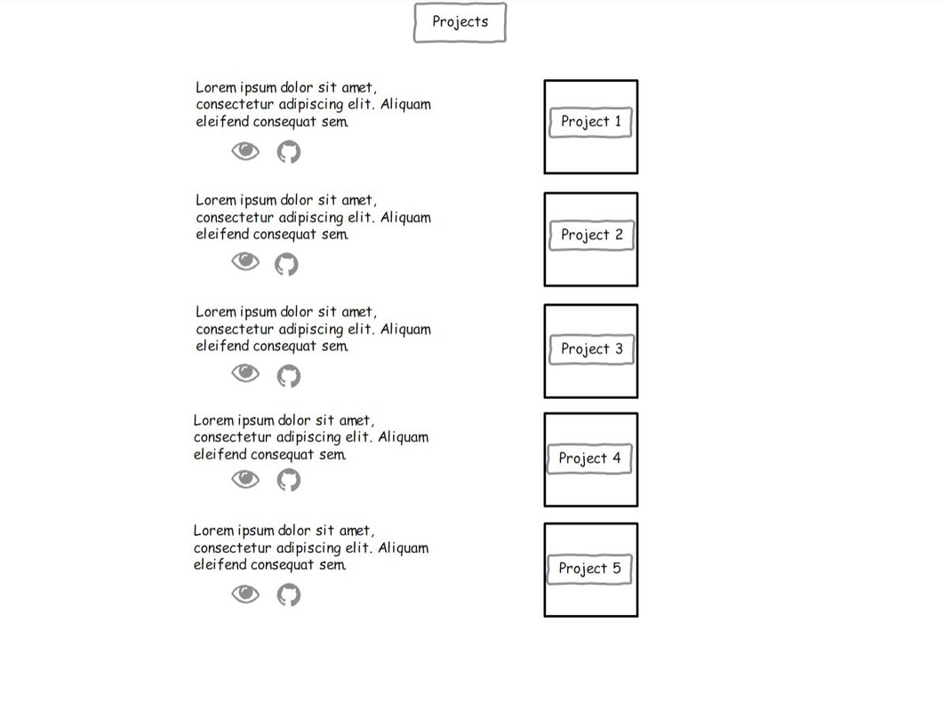  Mobile View: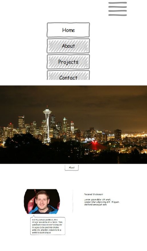 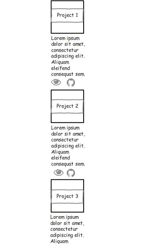 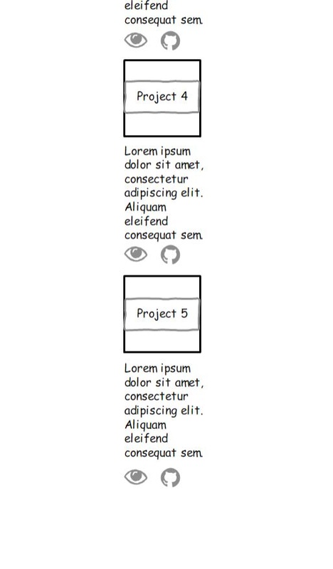 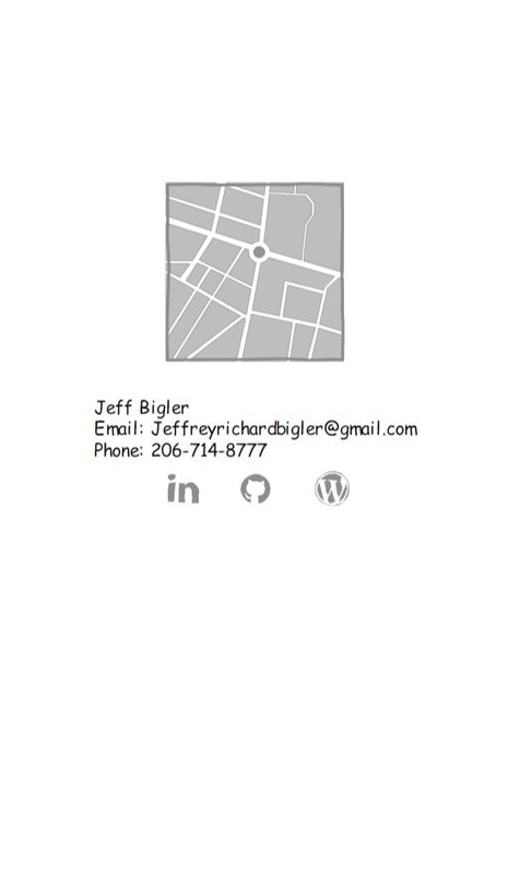 Site Map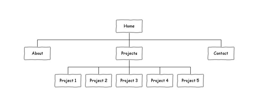 Fonts & Colors Font to be used: Helvetica Colors:  Color Code: #AA0000  Color Code: #000000 User StoriesUse Case Name: Find Web Developer Work User: John Doe Trigger: the user receives a portfolio URL in response to a job posting. Navigation: Story: As a user, I want to be able to navigate through the site smoothly and know where I am throughout the site. Size: Medium Acceptance Criteria:
Story: As a user, I want to be able to view the projects displayed, view the source code and view what tools were used to build the project. Size: Large Acceptance Criteria:
Story: As a user, I want to be able to easily view contact information of the portfolio creator to ask questions about projects or to schedule an interview. Size: Small Accepted Criteria:
Differences between Design StrategiesDesktop:
Audience Personas: Web Developer: John is a 35 year old senior programmer at a tech startup company in Seattle looking for a front-end web developer to join his team. His company is looking to expand the content they have on their website so that users can have a better experience when visiting their site. John is looking for someone with excellent communication skills, detail oriented and desire to continue learning. Goals:
Needs:
Desired Skills:
Project Manager: Jane is a 30 year old hiring manager for Amazon looking for someone to take on the lead for an upcoming project. Amazon has a new team set up and is looking for someone to lead the project forward. Ideally, Jane is looking for someone who is motivated, self-starting, and has a desire for innovation. Goals:
Needs:
Desired Skills:
List of Assets: Automation & the Human Laborer – DICE 3000:
Societies Interactions with the Internet –DICE 3050:
Descriptive Copy of Project: Automation & the Human Laborer: This paper is about the use of automation in the workplace and its effect on the human laborer. The paper goes into detail on how automation is currently used in the workplace and what the future outlook is like for jobs shifting more towards automation. Societies Interactions with the Internet: For this final project I will be writing a paper on how the internet has impacted society. The paper goes into detail the ways the internet has improved people’s overall life and also the negative implications the internet can have on people. Introductory Copy: My name is Jeff Bigler and I am a certified web developer in the Seattle area. I hope to leverage and continue developing my skills in HTML, CSS, and JavaScript as well as advanced JavaScript frameworks such as Angualr.JS and Node.JS. I am currently looking for employment in a front end web development role but am also interested in learning and collaboration opportunities that can grow my knowledge and understanding in web development.
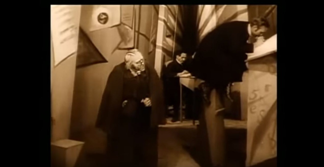 For my film scene analysis I chose to look at scenes from the 1920’s German expressionist film The Cabinet of Dr. Caligari. I decided upon this film based on previous study I have done on this particular movie for a film studies class I took a couple years ago. This movie is without a doubt one of the creepiest movies I have ever scene. This film was made before there was sound in film so there are no spoken words throughout the movie, just dialog cards which give you a snippet of what is being said. However, what the film lacks in dialog more than makes up for with its unsettling eerie score which is played throughout the movie. The Cabinet of Dr. Caligari was created by Weimer Cinima, or Cinema of Germany, which also produced the cult classic film Nosferatu. Although the Cabinet of Dr. Caligari was made back in 1920, the influence this film had on future movie productions which we see today has been striking. With the use of off-kilter sets in the film, a sense of horror from a psychological stand point is evoked. The unsettling expressionism of the production set in the movie has provided influence to current films such as Tim Burton’s Batman Returns (1992) and Alex Proyas The Crow (1994). 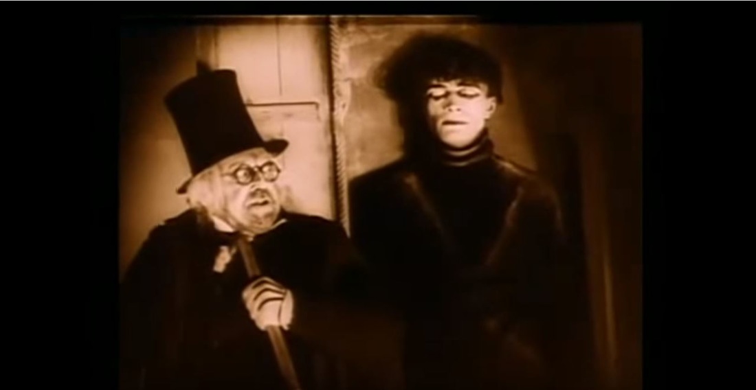 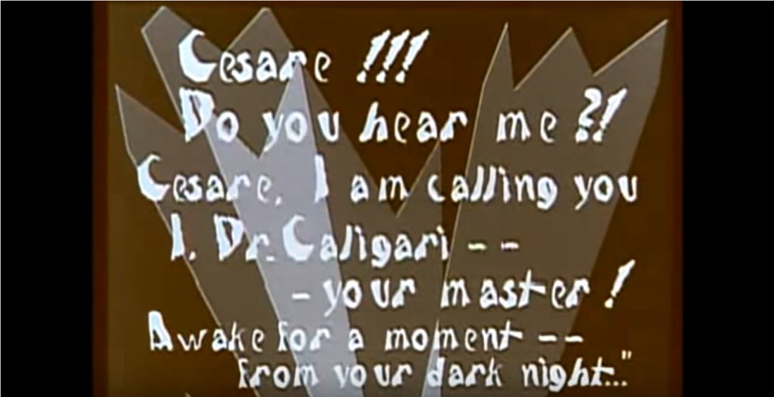 From the production set of the film, we see a lot of distortion with the size of objects and the angle of objects such as distorted walls. We can also see a lot of deep shadows as well as dark lines on walls that look to be painted on but could also represent shadows. These lines also show up in the dialog cards which continue the eerie and unsettling feeling the film is trying to portray. The size and shapes of the letters in the dialog cards seem to be uneven as well which helps fuel the creepy feeling you get when watching this movie. The audience for this movie seems to be for those who are interested in horror/thriller stories. Between the eerie music and the unsettling environment the scenes take place in, it seems as though this could have only been made for fans of horror. The distortion of the scenery in this film appears to try to simulate the mind of a deranged person, which this film takes place as a flashback from someone who is in a mental hospital. This seems to fit perfectly with the uneven lines along the walls and the abnormal height of objects. Source Sharrett, Christopher. Cinéaste 25, no. 4 (2000): 48-50. http://www.jstor.org/stable/41689297.  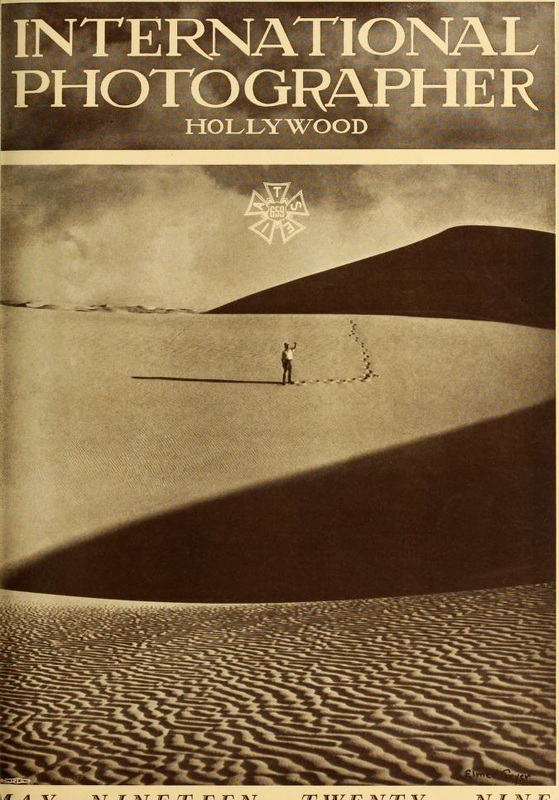 Source: http://www.archive.org/stream/internationalpho01holl#page/n52/mode/1up
For my early magazine analysis, I chose a photo from International Photographer issue from May 1929. This photo immediately caught my eye when looking through the images from different magazine issues. What I really like about this photo is the simple yet complex imagery that is captured. We see a simple vast open desert with a lone man standing in the middle of the page. There are also deep shadows present in the shot which add to the complexity of the image. Towards the bottom of the image, we see the shadows of the ridges in the sand which detail long windy lines stretching out across the desert. All of these elements together really paint an interesting image of the desert. We imagine the desert as just a vast, boring, empty plain, but we see in this image that even somethings that is perceived as simple can prove to be very intricate when looked at more closely. The context of this artifact seems to be the cover from the May issue of International Photographer. The image is a little cut off at the bottom but it seems to make out “May Nineteen Twenty nine.” Using this lead, I used Google Scholar to search for “International Photographer” “May 1929.” To my surprise I wasn’t able to find any results looking this up so I decided to leave out the issue date of May 1929 and just search “International Photographer.” While this search did produce some results, they were mainly just citations and nothing that rally added any context to the photo above. My next shot was to try to reverse search the image by inserting the image into Google to see if I could find anything of relevance. This actually brought me back to the Media History Digital Library website which I originally found the image, but the section of the website which the reverse Google search of the image brought me to had a small section that talks a little bit about the magazine itself and actually has the photo above listed as a thumbnail next to the section for reference. In the section of the site where the magazine is talked about is in the section titled “Technical Journals Collection (1916-1965).” This section seems to focus on Cinema and the changes that are taking place during this time in regards to technology. According to this section, the magazine “International Photographer” was co-published by a company called Local 659 and Moving Pictures Machine Operators of the United States and Canada which explains why this magazine is relevant to cinema. It also looks like by subscribing to this magazine, you were “given a membership of camera and lab personnel and projectionists” which makes sense why filmmakers would be attracted towards this magazine. Though titled “International Photographer” it seems as though a large part of the magazine was dedicated to film history articles as well as “coverage of films made on expeditions and far-off locations.” This was very interesting to me that a magazine which clearly appears to be solely about photography had such a big presence of cinema within its issues. As far as who the audience was for this artifact, I would say it was more directed towards filmmakers rather than photographers based on the content of the articles as well as the membership to camera equipment and projectionists. I think that the cinematography present in the cover photo of the man standing alone with only his footprints accompanying him also plays on what filmmakers would want in a magazine. I think the image does a good job of contrasting the emptiness of the dark shadows being cast next to the person in the image alongside abandoned feeling you get when looking at a person alone in the desert with nothing around them but empty open plains of sand. Citation Pierce, David and Eric Hoyt. “Technical Journals Collection (1916-1965).” Accessed October 19. http://mediahistoryproject.org/technical/ 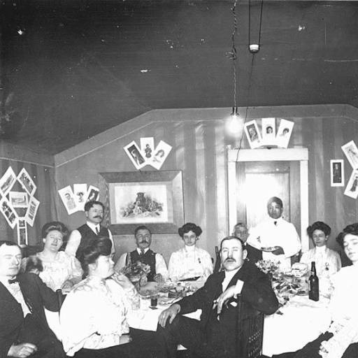 Title: Birthday party for Sweet Marie in Dawson, Yukon Territory
Source: University of Washington Libraries Photographer: Larss & Duclos Studio Year: 1900 Link to Collection: http://digitalcollections.lib.washington.edu/cdm/singleitem/collection/alaskawcanada/id/2777/rec/26 When looking through the collection of photographs from the University of Washington, this photograph in particular really stood out to me. We see a room filled with people at a party for, by the caption, someone named Marie. These kinds of photos from history are my favorite to examine. I find it really interesting to look at a photo such as this and try to image what these people were like, how they knew each other, and what would it have been like to be at that party with these people. The context of the photo seems pretty clear by the caption of the photo. It’s titled “Birthday party for Sweet Marie…” Judging by the number of people at the party, it looks like Marie was a popular person. We also see what looks to be a waiter in the back of the room dressed in a white shirt and jacket. This could show that Marie was either liked enough for her friends to splurge on a very fancy party, or she could be from wealth also. Something that took me awhile to realize in the photo is that the walls have been covered with photos of who I’m assuming is Marie since this is her party. This really shows how much the people at the party must care for Marie if they are decorating the walls with images of her. While little is said in the description of the photo, the little information that is provided seems to paint a really detailed description of the kind of person this Marie was. Marie was given the title of Sweet Marie which is telling that she was looked upon highly by her friends to have labeled the photo with that title in front of her name. The Sweet in her name is also capitalized signifying that this could be nickname of hers know by many. Searching for any relevant information surrounding this photo on Google Scholar proved to be pretty difficult. I first tried searching the tittle of the photo hoping that there may have been a story surrounding the party written down somewhere. But the title ended up not providing any clues. I then tried searching the name of the photography studio, Larss & Duclos Studio, but that didn’t provide any results either. Even searching the area of Yukon Territory in Alaska didn’t bring anything relevant to the photo. This really surprised me that so little is known about this party. But, the lack of information on this photo also makes it that much more interesting. It makes you wonder what kind of personality this Marie had that gave her the nickname of “Sweet.” But, at the same time, for all we know this Marie could have been just as easily a ruthless tyrant and the title of “Sweet’ is like an antonym. Marie could have forced these people into throwing her a party. The unknown surrounding photos are ones that I find more fascinating because the story behind them could be about anything. 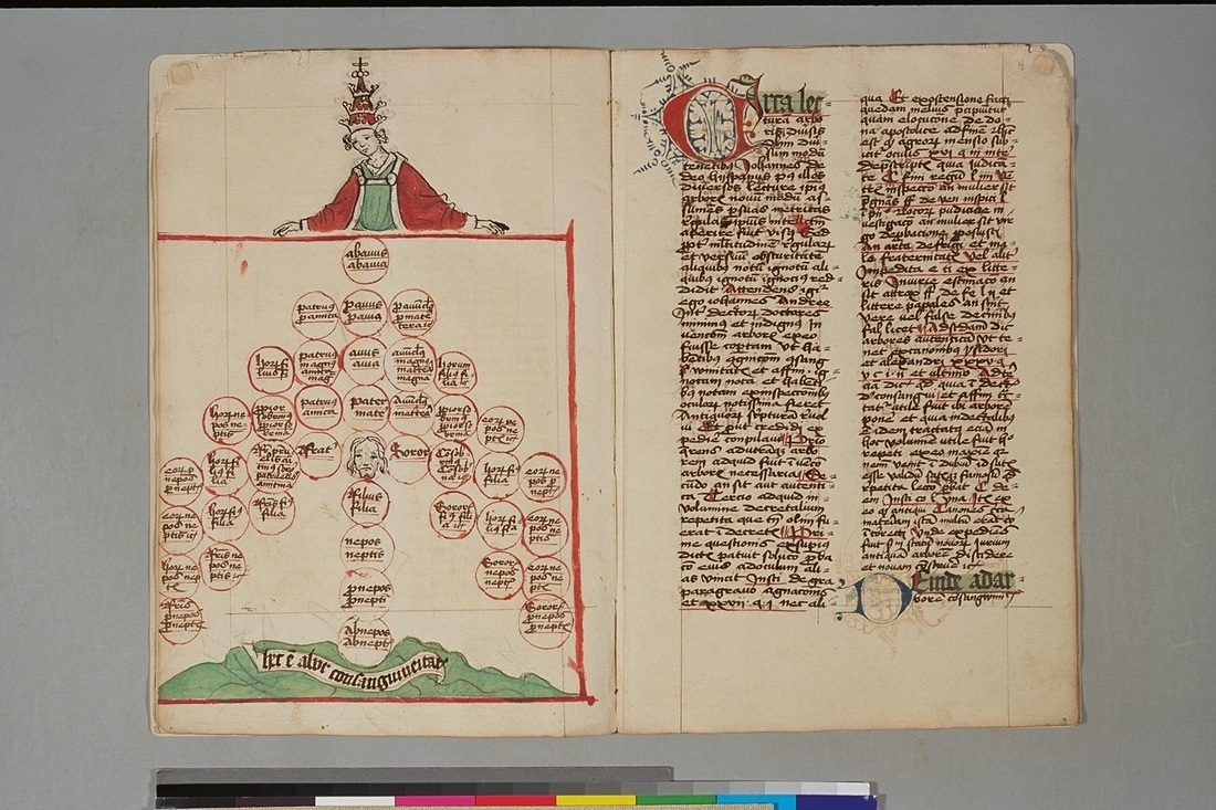 Title: De arbore consanguinitatis et affinitatis
Author: Iohannes Andreae Country: Germany Language: Latin Description: Pope presiding over a tree on consanguinity. This religious themed manuscript that I chose appears to be dated somewhere between 1450 to 1499. The reason I chose this manuscript to do my analysis is because of its religious theme. Maybe it’s because I grew up going to Catholic grade school and high school but I’ve always been interested in learning about religions and how people practiced their religion through history. Having taken many of classes on Catholicism, this manuscript which features an image of a Pope looking down on a lineage tree made me think of how Catholicism was practiced during the mid to late 1400’s. A big reason why I really enjoy learning about world history is that I like to think about what it would have been like to live during the time a piece of history was being created. Looking at this manuscript makes me wonder what it would have been like to be a Catholic during this time and how the religious practices of that time compare to what is being practiced today. For my secondary research of this artifact, I had some initial troubles finding information about the piece. I first did a search by just the title but the results which came back mainly broke up the words in the title and brought back results in what appeared to be German. I decided to try a search on the authors name next but when searching for “Iohannes Andreae” the search results came back suggesting “Did you mean Johannes Andreae?” This left me curious because I couldn’t imagine that Columbia University, where this manuscript is archived, would have missed the spelling of the authors name. So, I decided to try a third search by using the authors name, Iohannes Andreae, and including the title of the piece with quotes around the title. This brought up a search result with the suggestion again for Johannes Andreae. In this search result though was a book which included a section on author Iohannes Andreae and about the subject of consanguinities which is what the tree in the manuscript is depicting. This left me a little puzzled because it seems as though Johannes is the correct spelling of the authors first name as the source within this search result talks of this author as well as what the type of diagram that is depicted above represents. The manuscript itself is done in a very artistic way. We see classic decretive first letter on the right hand page that fits the style during the time. There seems to also be patters arching out from the letter as well which help to bring more attention to the beginning of the page. On the left hand page we see a Pope looking down on a lineage tree which appears to have the names of family members which make up the structure of the tree. The image itself takes up the entire page which signifies that the writing on the right hand page is about this tree. The color scheme that is being used is red and green which is used on both the picture and writing. I’m not sure if this scheme is used on purpose or if the colors red and green were the only ones they had to use. I did notice though that the letter at the bottom of page with the text has a decretive first letter as well and it seems to be using the color dark blue. However, the dark blue might just be black that has faded and now appears blue. What I found interesting with the image of the tree is the expression on the faces depicted. Both faces shown in the image appear to have a somber expression on them. I’m not sure if this was intentional but it is something that is noticeable on both faces. The source which I found from my research was a section from a book titled “Blood and Kinship: Matter for Metaphor from Ancient Rome to the Present” written by David Warren Sabean and Simon Teuscher. In the chapter from the book titled “Flesh and Blood in the Treatises on the Arbor Consanginitatis” the author talks about what the image of this lineage tree represented and also discusses briefly on the author Johannes Andreae. From the chapter, the author author Iohannes Andreae is mentioned as a prominent Bolegnese lawyer who is known for writing about these lineage trees. From this source it appears as though the lineage tree is called a consanginitatis, which explains why the above manuscript is described as “Pope presiding over a tree on consanguinity.” What it appears a consanguinity is, is a diagram which was used to represent kin-relationships and show interrelated kin. The purpose of this was used to check if two people who were planning on getting married were related in any way and how closely related they were. There apparently is a special way of reading the diagram to determine how closely related two people were almost using it like a math calculator. The special way to read this diagram has to be taught and the method used was given the nickname “kinship calculus” (Sabean and Teuscher). Source Sabean, David Warren., and Simon Teuscher. 2013. Blood and Kinship: Matter for Metaphor from Ancient Rome to the Present. UK: British Library Cataloguing. 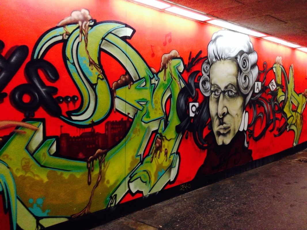 For my artifact, I chose a piece of street art I saw when I was in Salzburg Austria. The street art depicts an artistic image of the musical composer Mozart. Salzburg was the birth place of Mozart so the art depicting the classical composer fits the setting of the city where the art resides. This graffiti art is special to me because of the memories it represents. Salzburg was one of my favorite cities I visited when traveling around Europe and looking at this photo of street art takes me back to the good times I had in that city.
When looking up the context of this art, I wasn’t able to find much. I really wasn’t able to find any information on the art in regards to who created it and when. Other people have posted pictures of the art online but not much is said about its origin. This doesn’t come as much of a surprise as the art resides on a city walkway and I’m sure the artist would prefer to remain anonymous. Where this mural is displayed is in an underground walkway that leads pedestrians to the part of the city known as “old town” or “old Salzburg.” The city of Salzburg is divided by the Salzach River and separates the old part of town from the new part of town. Once you cross the river from the new part of town, there is a busy street you must cross to get to the old part of town. Instead of waiting for the light at the crosswalk, you can take an underground walkway under the busy street to get to old town. After you walk down the steps and turn into the walkway is where you see this mural. The mural takes up a large section of the wall which (I would guess) is probably around 8 to 9 feet tall. While it doesn’t take up the entire side of the wall throughout the walk walkway, it’s certainly large enough for everyone to notice each time they walk past. With Salzburg being the birthplace of Mozart, the location of the mural is very fitting. It appears that the artist specifically chose this place to paint the mural as the house where Mozart grew up in is located only a block or two away from the painting. This makes it seem like the audience for the mural is for tourists visiting the city and also for local residence who embrace their cities rich history. There is a definite feeling of pride from the citizens of Salzburg for its cities history which makes the mural of Mozart have a strong cultural aspect associated with the art. The abstract design style of the lettering around the portrait of Mozart also fits the typical “graffiti style” that you see with most kinds of street art like this which could be viewed as “visual grammar”. I can’t quite make out if the lettering and design behind the portrait is supposed to symbolize anything and if it is, because this is in Austria, I’m not sure if I would be able to understand what it represents. This does, however, remind me of the Julia Turner article “The Big Red Word, the Little Green Man” where even though there is a language barrier within this city where many tourists travel to from all over the world, this image of Mozart is universally recognized no matter what language you speak. Hello, my name is Jeff Bigler. I am born and raised in the Seattle area and I currently work in Insurance financing but am hoping to change my career path towards web development soon. I am also finishing up the WATS web development program here at Seattle U and would encourage anyone who has any interest in web development to give the WATS program a try and take one of their intro classes. Looking forward to getting to know everyone more during the quarter!
|
AuthorWrite something about yourself. No need to be fancy, just an overview. Archives
December 2016
Categories |
 RSS Feed
